Enterprise Brand System
Designing the visual operating system for a nationwide financial services company's internal brand.
Brand
Overview
Following extensive employee research and employer brand strategy, First American needed a unified internal brand that could create a more consistent employee experience.
Over nearly two years, I partnered closely with the Brand Director to shape the strategic foundation and lead the visual system, navigating review and approval across executive brand leadership, HR, and internal communications before guiding implementation with support from other designers.
My Role
I played a central role in shaping the brand’s strategic foundation, including its vision, employee value proposition, guiding principles, personality, voice, and tone. I then led its visual expression from exploration through implementation across layout, typography, color, photography, illustration, motifs, naming, logo governance, and templates.
Internal Identity
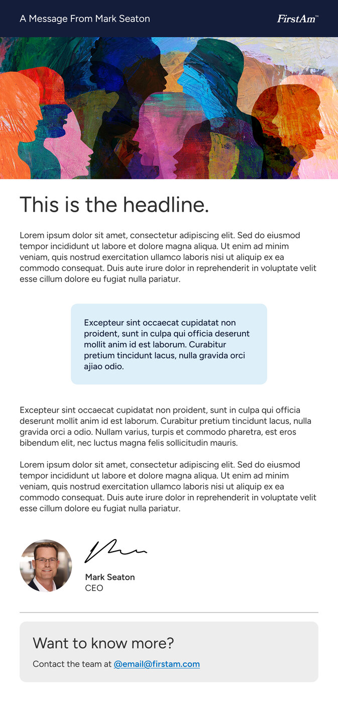
“FirstAm” was already an organic shorthand for First American, making it a natural foundation for the employee-facing identity. I helped formalize it into both a visual identity and a consistent naming system that brought programs, platforms, and resources under one recognizable brand.
Previously, internal initiatives were named independently, creating inconsistency and unnecessary brand clutter. We introduced a clear nomenclature across touchpoints (e.g., FirstAm Leadership, FirstAmOnboarding) making them easier for employees to recognize.
Internal
External
Initiative and Program Examples
Photography
I developed two complementary photography directions to express different sides of the employee experience.
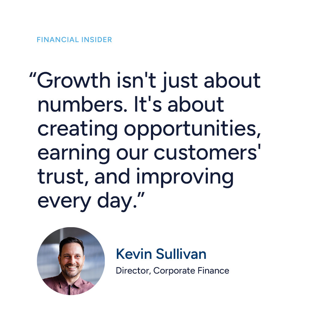
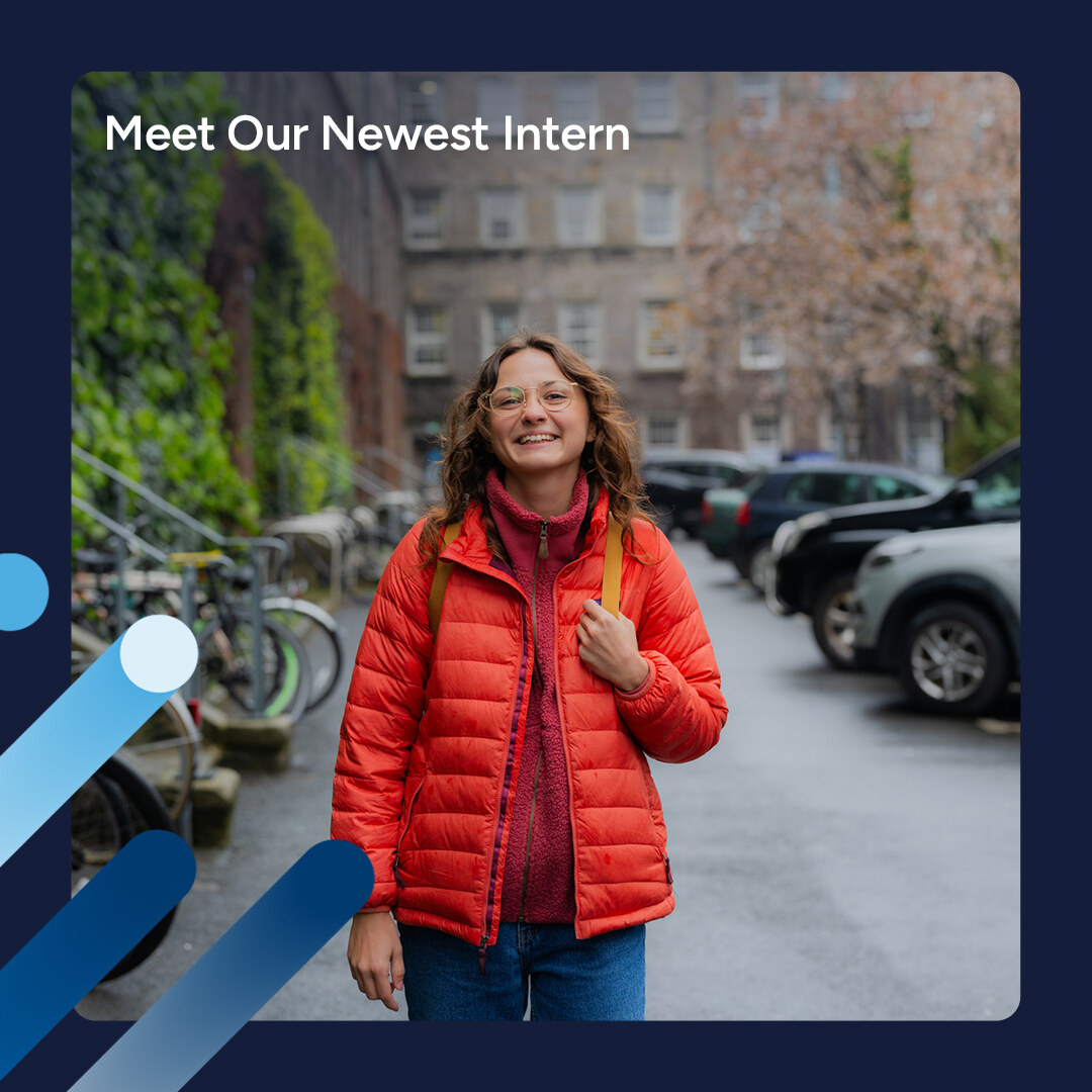
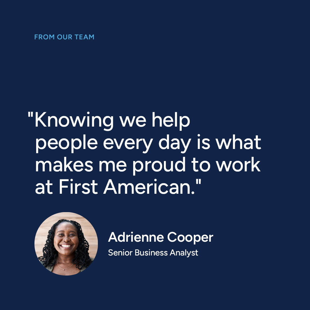
Studio photography brings consistency to profiles, recruitment, and major brand moments. Environmental photography captures warmer, more candid moments that communicate culture, connection, and movement. Together, they create a visual language that feels professional, human, and recognizably FirstAm.
Studio




Environmental




Grid and Layout
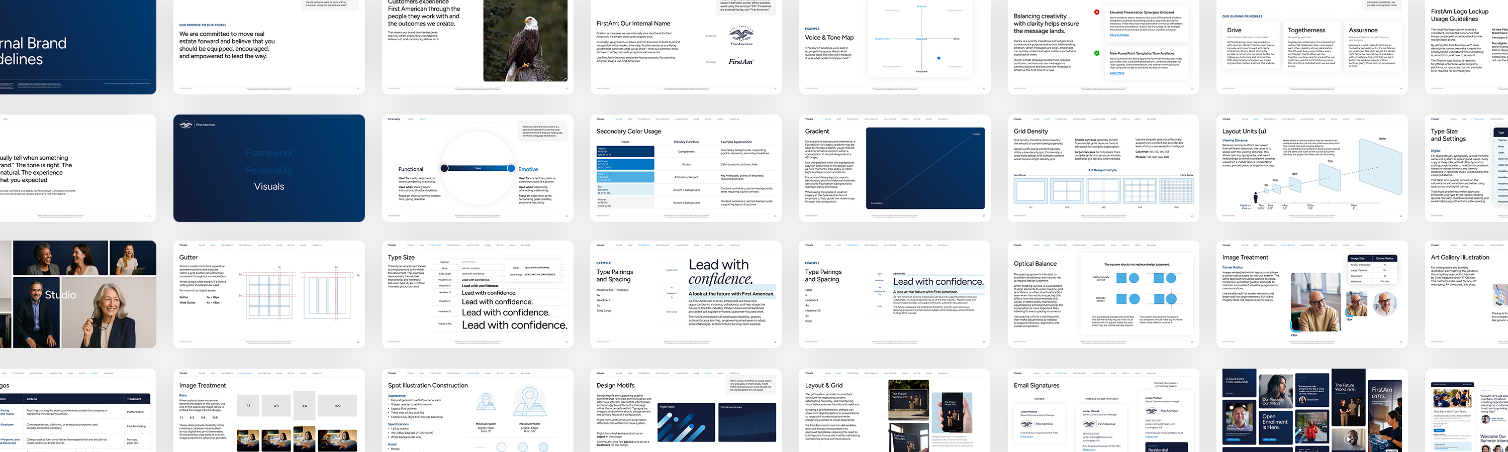
I developed a flexible grid and spacing system that could create consistency across everything from digital graphics and presentations to print and large-format communications.
Columnar and modular grids support different types of content, while a scalable unit system connects margins, gutters, typography, imagery, and spacing. The result is structure without rigidity, giving designers clear standards while leaving room for judgment.
4:3 grid examples
1:1 dimensions, 2x2 grid, 9u margin
Spot Illustration
I established the illustration direction, defining its geometry, palette, construction, and role within the broader identity. I then handed the system to another designer to expand into a larger library, providing the creative foundation and guardrails needed to keep the work cohesive as it scaled.












Design Motifs
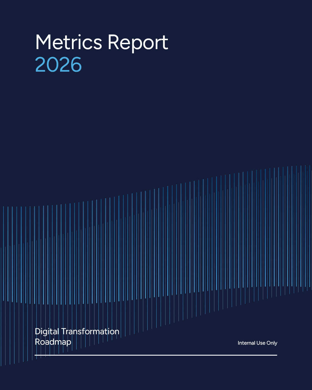
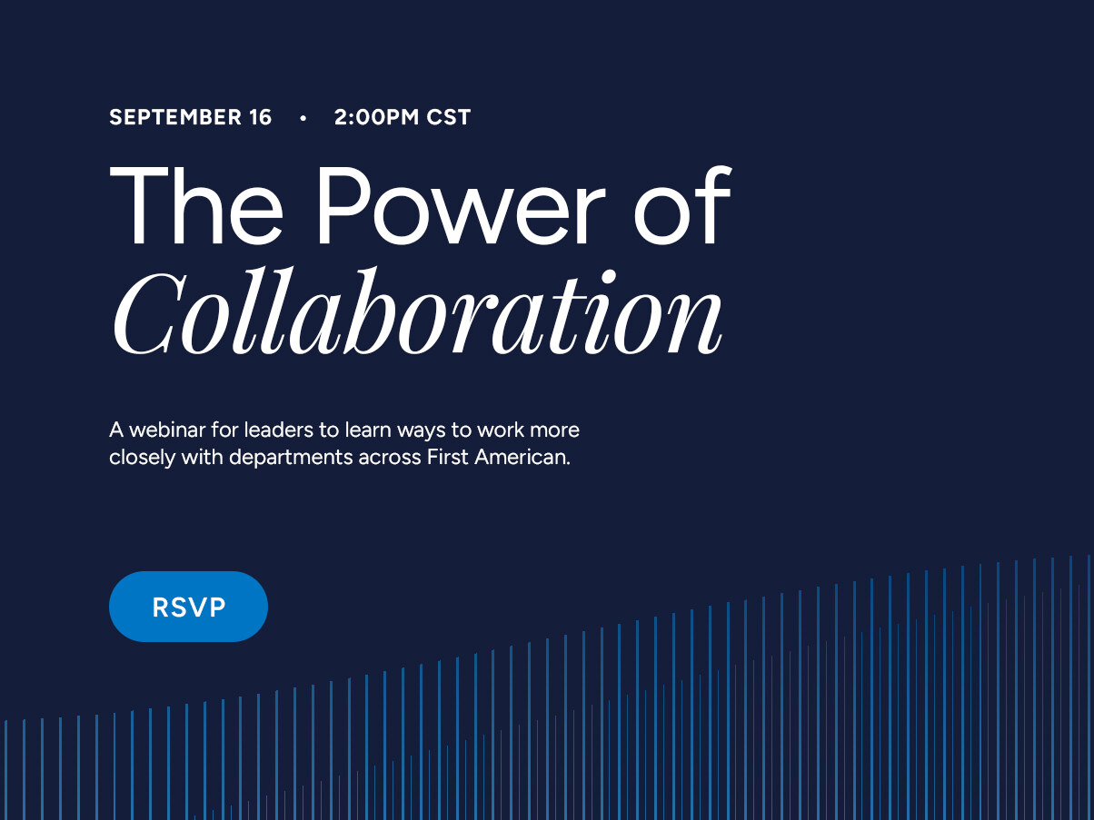
I developed two motifs with distinct roles. Flight Paths function as active graphic objects, used sparingly to draw attention and emphasize key content. Continuum Lines act as a passive atmospheric treatment, adding texture and brand presence while allowing the message to remain the focus. The two are never used together within the same composition.
Continuum Lines

Flight Paths

System in Practice
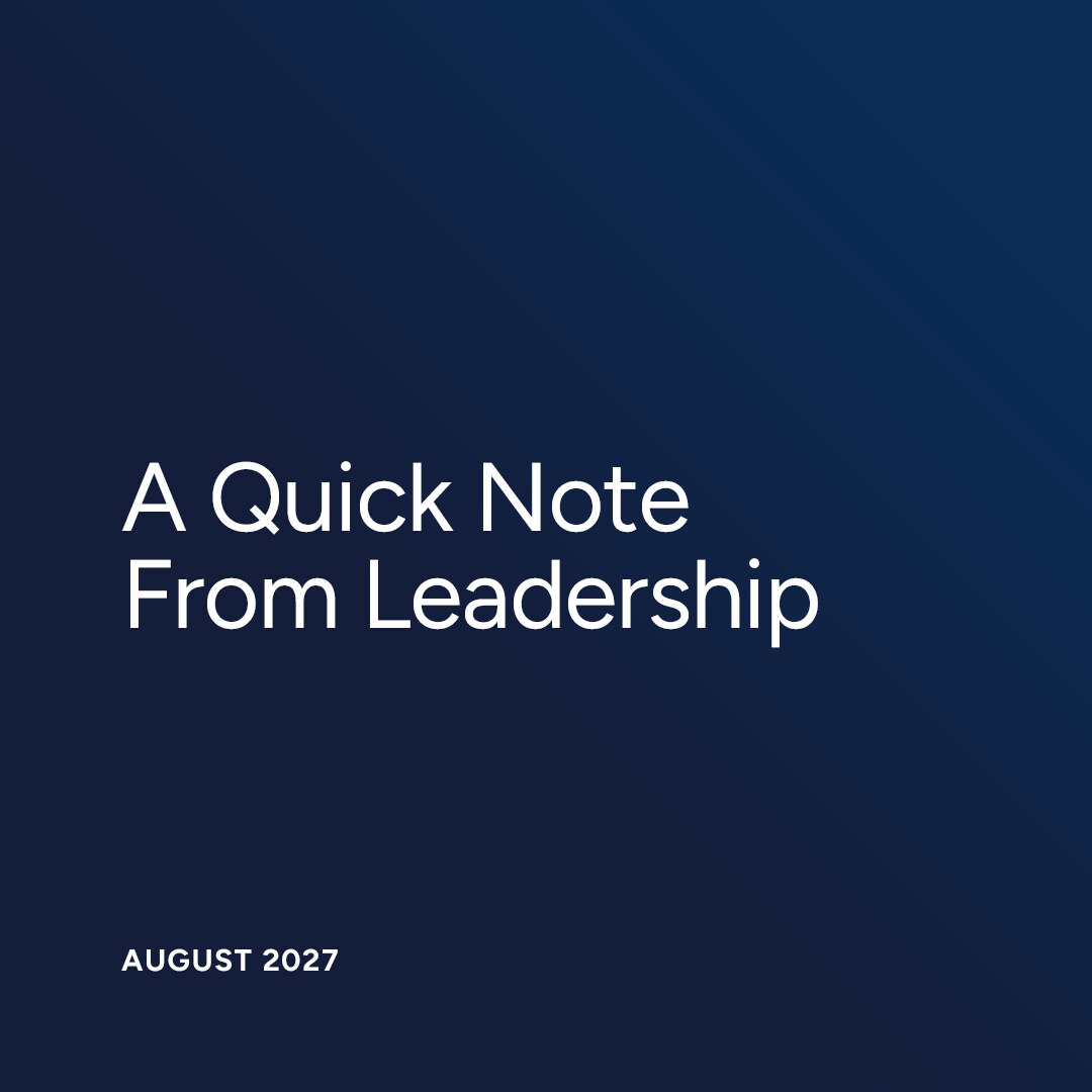
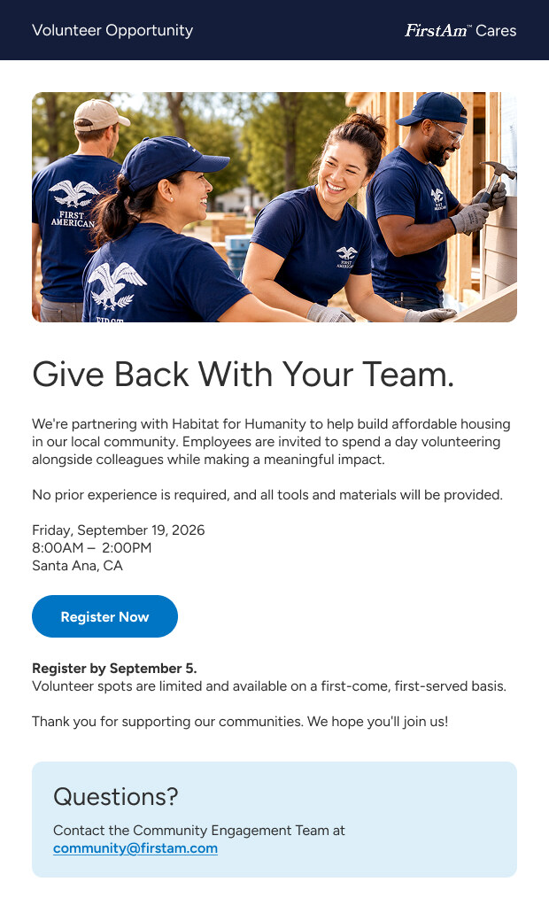
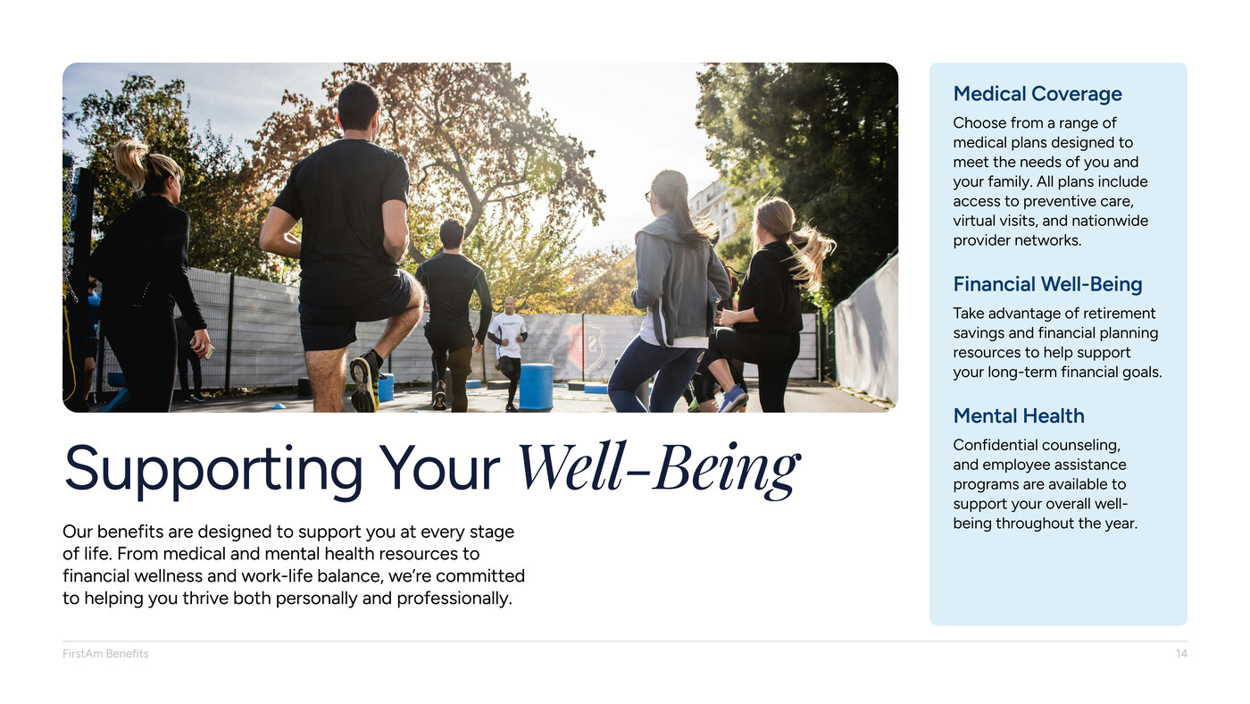
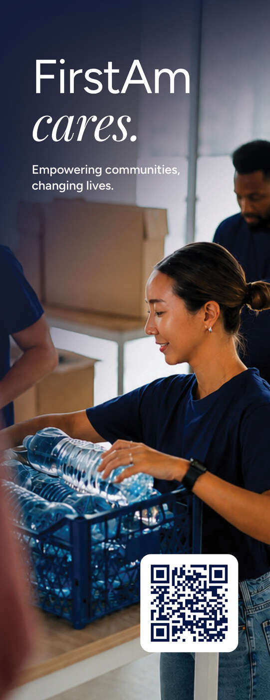
The final system was designed to support a wide range of employee communications without forcing them into one visual formula. Templates, examples, and governance standards gave teams a shared foundation while preserving enough flexibility for the message and context to lead.